Creating a peaceful and inviting atmosphere in your home starts with the colors you choose for your walls, furniture, and décor. Calm colors have the unique ability to soothe the mind and create a sense of balance, making your living space more enjoyable and restful. Whether you’re redecorating a single room or your entire home, selecting the right calm colors can transform your environment effortlessly.
In this post, we’ll share helpful tips for choosing calm colors that promote relaxation and harmony in any space.
Why Choose Calm Colors?
Before diving into color options, it’s important to understand why calm colors matter. Colors can affect mood and energy levels. Bright, bold colors may energize or stimulate, while calm colors tend to relax and comfort. Using calm hues in your home can help reduce stress and create an environment where you feel safe and at ease.
Calm colors often come from soft tones with low saturation, such as muted blues, gentle greens, warm neutrals, and soft pastels. These colors work well in bedrooms, living rooms, bathrooms, and any space where you want to unwind.
How to Choose the Right Calm Colors for Your Home
Here are some tips to guide you in selecting calm colors that fit your style and space:
1. Consider the Room’s Natural Light
Natural light affects how colors appear. Rooms with a lot of natural light can handle cooler tones like soft blues and greens because the light keeps them feeling fresh. In contrast, rooms with little natural light may benefit from warmer calm colors, like beige or soft peach, to keep the space feeling cozy rather than cold or dull.
2. Start with a Neutral Base
Neutrals such as off-white, taupe, or pale gray create a calming foundation that pairs well with other muted tones. Using a neutral base allows you to introduce soft accent colors easily through furniture, art, or textiles without overwhelming the room.
3. Use Color Swatches to Test
Before committing, get paint swatches or sample pots and test the colors in your room. Observe how they look at different times of day and under artificial lighting. This step helps you avoid surprises and ensures the colors stay calm and inviting in your unique space.
4. Choose Colors That Reflect Your Personality
A calm color palette doesn’t mean boring. Think about colors that you find personally soothing or uplifting. If you love nature, soft greens and blues might feel peaceful. If you prefer earth tones, warm beiges and muted browns could be your ideal calm palette.
5. Stick to Two or Three Main Colors
To maintain a tranquil atmosphere, avoid using too many colors. Pick two or three complementary calm tones to keep your space cohesive. You can add subtle patterns or textures within this limited palette to keep the design interesting without overwhelming the senses.
6. Explore Popular Calm Color Options
Here are some commonly used calm colors and their effects:
– Soft Blue: Evokes peace and serenity; ideal for bedrooms and bathrooms.
– Sage Green: Connects to nature; brings freshness and balance.
– Warm Beige: Creates warmth and comfort; works well in living rooms.
– Lavender: Gentle and soothing; adds a touch of subtle elegance.
– Pale Gray: Modern and sleek; offers a quiet, neutral backdrop.
7. Incorporate Calm Colors Through Furniture and Accessories
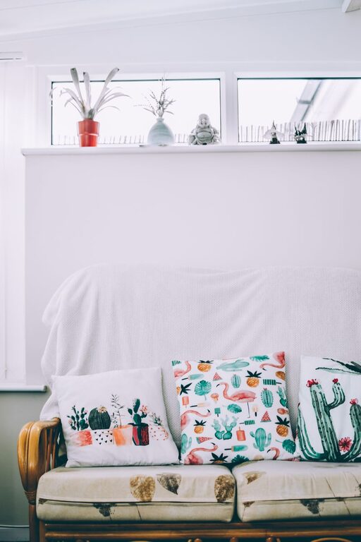
If you’re hesitant to paint walls in calm colors, start by adding them through furniture, rugs, curtains, or throw pillows. These elements can introduce calm tones that complement your existing décor and can be changed easily as your preferences evolve.
8. Balance Calm Colors with Lighting and Texture
Lighting and texture play a big role in how calm colors feel. Soft lighting, such as lamps with warm bulbs or dimmers, enhances tranquility. Incorporate textiles like linen, cotton, or velvet to add depth and comfort without disrupting the calm palette.
Common Mistakes to Avoid When Choosing Calm Colors
– Choosing colors that are too dark: Too much dark color can make a space feel heavy or gloomy rather than calm.
– Ignoring undertones: Some colors have cool or warm undertones that affect the mood of a room. Make sure your calm color’s undertone matches the atmosphere you want.
– Overloading with different shades: Too many variations can clutter your design and remove the peaceful feeling.
– Skipping samples: Always test colors in your actual room before making a final decision.
Final Thoughts
Choosing calm colors for your home is a rewarding way to create a soothing, balanced space. By understanding how colors interact with light and mood, testing samples, and focusing on a simple palette, you’ll enjoy a home that feels restful and inviting every day. Remember, calm doesn’t mean dull—it means thoughtful, intentional choices that help you unwind and recharge.
Start with the tips above, and let your home become your personal haven of peace.